
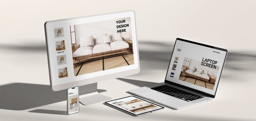
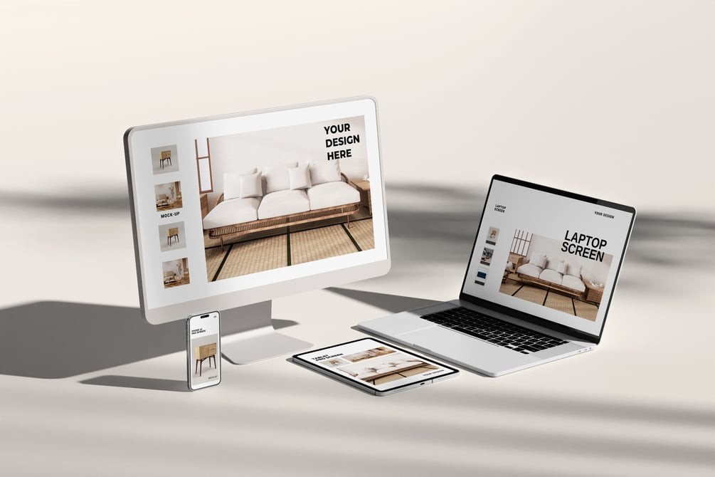
This is a free multi device mockup: one layered PSD with a desktop monitor, a laptop, a tablet and a phone, each with its own smart object, so a single website shows on four screens at once.
Responsive work is hard to sell with four separate screenshots. Put them in one scene and the client gets it in a second: same brand, same content, four sizes. The soft daylight and shadows keep it from looking like a flat template.
What’s in the free multi device mockup PSD
- One PSD at 3000 × 2000 px, 300 DPI
- Smart objects for the screens, organized layers and folders
- Background colour you can change, plus a light adjustment
- A PDF guide, all in a 39 MB ZIP
How to fill four screens without the mess
Don’t paste one screenshot four times. Export the real breakpoints: the desktop layout for the monitor, a narrower one for the laptop, tablet and mobile views for the rest. That’s the whole point of a responsive mockup, and it’s what a client will look for first.
In Photoshop, double-click each smart object, paste the matching screen, save, and the scene updates. Then pick a background colour that sits close to the site’s own palette. A pale tint usually beats pure white.
No Photoshop yet? Adobe's Black Friday sale runs until 27 November: Creative Cloud Pro, with Photoshop, is discounted for new subscribers. Students get the biggest cut.
More free device mockups
- Multi devices responsive mockup, a second free scene in a different layout.
- PC mockup, when the desktop view needs to carry the pitch on its own.
- Hands on laptop mockup, for a laptop screen that looks in use.
Download the free multi device mockup
The file is on Gumroad, made by faisal (graphicworld89). Enter 0 in the price field to get it free. The page doesn’t list licence terms, so check with the creator before using it in paid client work.
